360-degree Business View: Clear and Compelling
A famous mathematician, John Tukey, once said, “The greatest value of a picture is when it forces us to notice what we never expected to see.”
In the business intelligence world, we call them the “aha moments!”
Let’s look at an example of this through a DataSelf Analytics dashboard designed by the CFO of one of our clients.
Every morning, the CFO receives this dashboard by email. This provides him with a 360-degree view of his entire business at a glance.
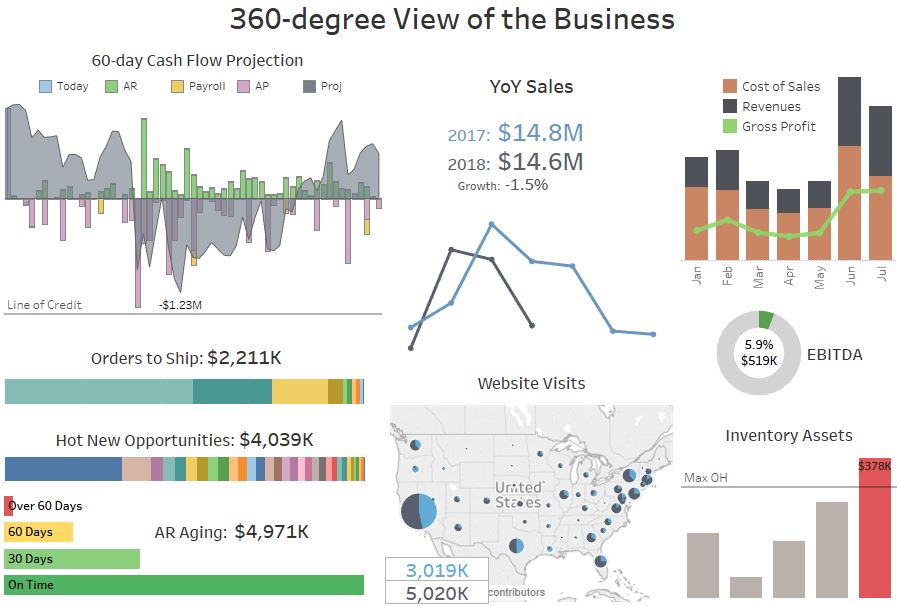
Here are a few things you should notice right away:
- The left side of the dashboard has a view of lead metrics. These show insight into future transaction data like cash flow projections or orders to ship.
- On the right side of the dashboard you see lag metrics. These show the past performance of the business.
- The CFO can drill down into each chart by clicking on them, to understand the underlying trends, and take any action.
Inventory Assets
The red bar on this graph means that inventory on hand is too high.
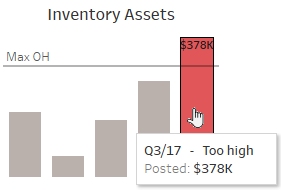
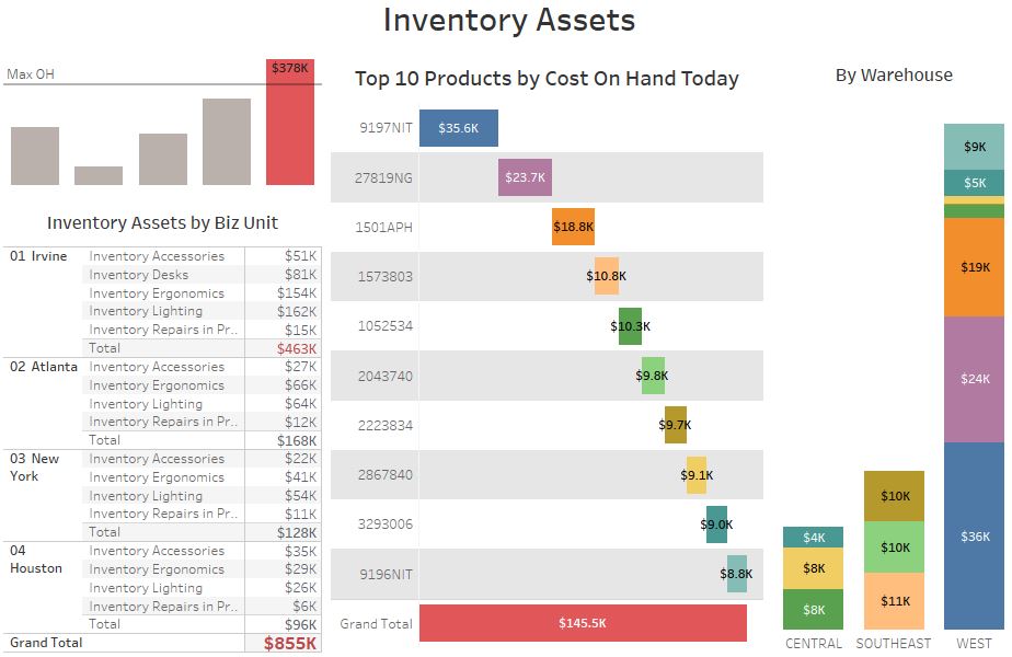
Clicking on this bar, the CFO can drill down into:
- Inventory by business unit.
- Cost on hand by the top ten products.
- The warehouses where the top items are currently located.
Let’s go back to the main dashboard.
Late AR Aging
On the dashboard, you can also see that the 60-days late AR Aging bar is quite big!
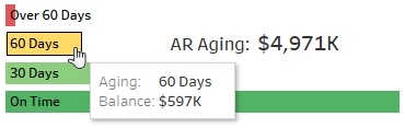
Let’s see which clients are getting late by clicking on this bar.
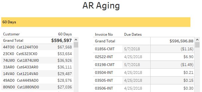
Here they all are, and here are all of the past due invoices. These invoices are sorted in descending order by balance due.
Let’s go back to the main page and investigate web traffic now.
Website Visits
On the main dashboard, the CFO can draw a box around the area of country to see website visits from visitors there.
Let’s see how many website visitors we’re getting from the east side of the country.
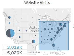
First draw the rectangle, and then click on Website Visit Details.
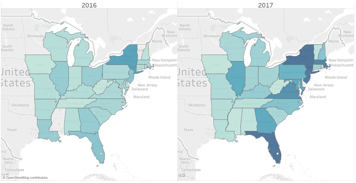
Nice! The darker blue areas mean more visits came from those areas. You can see from this map that there are states with major growth compared to last year!
Cash Flow Projection
From the main dashboard again, let’s take a closer look at the cash flow projection.
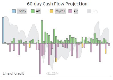
The 60-day Cash Flow Projection includes several pieces of data.
- AP reveals inbound money from receivables.
- AP shows outbound money for payables and payroll.
- Today shows how much cash is on hand today.
By adding all of these metrics, we get the cash flow projection for the next sixty days.
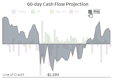
As long as the minimum projection doesn’t cross the line of credit, the CFO doesn’t have to worry about cash flow.
Receivables Invoice Dispute
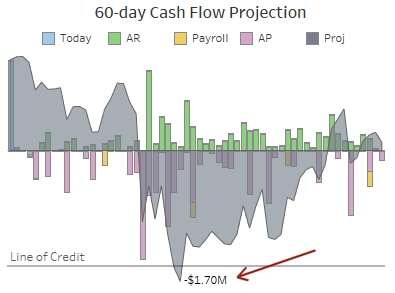
Now let’s play a what-if scenario where a client disputes a receivables invoice.
Let’s examine what happens when we exclude that invoice.
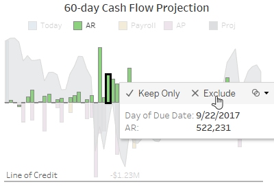
Without that receivables, the line of credit won’t be able to cover the cash needs and the company will have a problem.
Dashboards should:
- Inform key trends at a glance.
- Allow users to easily drill down into the details.
- Help users understand the underlying trends and then take appropriate action.
In our next post, we’ll take a look at additional Sales, Customer, and other valuable dashboards that are included with DataSelf’s Dashboard 2.0. Don’t want to wait until our next blog post?
Visit our YouTube channel to watch the Dashboard 2.0 video series:
Contact DataSelf online or call us at (888) 910-9802 to learn more about DataSelf Analytics Dashboard 2.0.