Thomas Edison didn’t create the lightbulb in a single try. He experimented and failed 1,000 times before creating a working light bulb!
The same is true with building better dashboards. Your first attempt may look okay, but by experimenting often and improving on your work, you can make your visualizations much more useful.
Chart Experiment Examples
Here is one example of a chart that works, but the layout and the coloring requires you to use more of your attentive brain to understand the message.
Let’s look at how just changing a few minor things lets you to use your pre-attentive brain, and the message becomes clearer.
By changing the format to a line graph rather than a bar chart, it allows you to see the answers much more quickly.
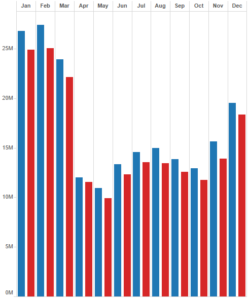
In the following example, a client was trying to see how long it takes for online campaigns to result in sales.
Here’s the first chart they developed to compare the two.
Each graph shows data over the same time frame. This approach works, but it could be better.
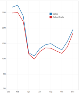
Over time, as they experimented, they finally arrived at this perspective.
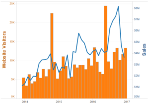
This is a much better layout. Here’s why:
- It uses a dual axis.
- The color of each axis tells what the actual legend is.
- It uses the same exact real estate as the original report.
This report makes it easier to correlate website traffic with real business results. The layout is very clean and much more informative.
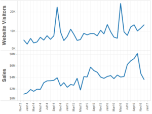
Let’s look at one more example from another client.
The following chart shows which customers grew the most in sales, or lost the most in sales year-to-date.
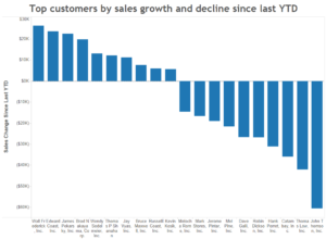
This layout is very hard to read. You have find the customer name and trace it up to the top where the bar chart is.
Here is a much better approach.
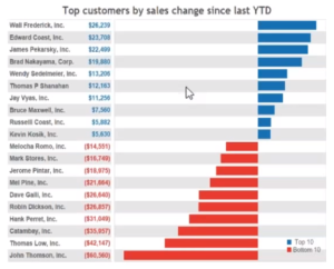
Here’s why it’s better:
- The view is horizontal, which is easier to read.
- Blue and red colors make it easier to see what’s going on.
- Adding numbers lets you see at a glance how much each change was.
Here is another enhancement this company made to the same chart.
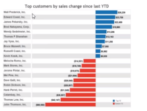
This is a great layout. People who are more numbers-driven may get insight from the numbers on the chart. People who are chart-driven will focus on the bars.
It’s a solution that makes the chart more useful to everyone.
Rendering Better Dashboards
Once you’ve developed multiple charts and graphs, it’s time to build a dashboard.
There are some important features you want to include when you’re creating a BI dashboard.
It should be:
- Accessible from desktop, web, and mobile clients.
- Able to push reports (via a mobile app).
- Offer self-service access (clients can view a web page and pull reports).
- Capable of sending alerts (such as an email) when something important changes.
- Able to send data to other applications.
There are a few other things you have to consider when creating a dashboard for data visualization.
Security: Your data should be secure. Access is sometimes even limited within a company. Test this extensively. Data should never get in the hands of the wrong people!
Flexible Display: Your BI platform should be adaptable to different screen sizes. We use the Tableau framework which handles this very well.
Interactivity: Allowing users to create reports on-the-fly can be valuable for analysis, but also potentially very confusing. Use wisely.
Finally, pop-up Windows are another nice feature, but always remember that short-term memory is very short. Make sure important data is always visible, and only use pop-ups to enhance that.
You can see an example of this in the CFO dashboard below, which also combines all of the advice we’ve gone over so far in this post.
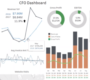
Providing a useful dashboard to your users doesn’t have to be difficult or even very complicated. But it does require understanding the needs of your users.
Then, you can create a dashboard that uses real estate wisely, applies colors and a layout that appeals to the pre-attentive brain, and in the end tells your users exactly what they need to know as quickly as possible.
To read more about telling your data story using dashboards, read our entire blog series by clicking on the topic below.
Introduction to Dashboards, How to Use Color, Chart Types and Formatting, Experimenting with Dashboards, Visualizations to Avoid, Layout