“Once upon a time…” Everyone loves a great story. I know that I do. Stories capture people’s attention and hold it until the very end.
That’s why it’s important that your dashboards also tell a story that grabs people’s attention and lets them see the big picture at a glance.
In this blog series, I’m covering a bit of the science and a bit of the art required to do that! To read part 2, click here.
What Does a Great Dashboard Look Like?
A great dashboard can:
- Provide insights at a glance. You don’t need to read extensive notes to understand what’s going on when a dashboard gets it right. You can see at a glance the key takeaways.
- Reflect individual user needs. The data your CEO needs may be very different from the report customer service needs, for example. Why should they see the same dashboard?
- Support faster decision making. Well-designed reports that tell a story at a glance give you what you need to know to make decisions faster and better.
I talk to a lot of people and each one has a similar question. “How do I get my dashboard to do what I want it to do?”
How Your Brain Understands Data – Caveman Brain Science
When you understand how your brain processes data, it quickly becomes apparent how well-designed dashboards really grab your audience’s attention.
Pre-attentive processing refers to how the brain processes data. Throughout evolution, the human mind has evolved to make spot-second choices based on forms, shapes, colors, and position. It’s easy to see how this evolved—a glance into the jungle can reveal a tiger crouching behind a bush if the brain can quickly pinpoint stripes against the leaves of a tree. When it comes to reports, this same process can be used to create reports and data visualizations that harness the pre-attentive processing centers of the brain so that you can quickly get your point across.
The following picture shows examples of choices to highlight outliers.
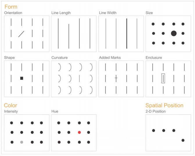
Image Source: Tapping the Power of Visual Perception by Stephen Few.
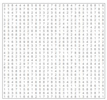
Let’s look at an example. In a few seconds, can you find all 9s in this chart?
How about all 9s in this chart instead?
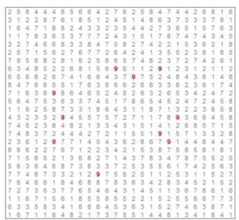
By using color, we’ve been able to make the number 9 “pop” out from the other numbers so you can see them at a glance. In this case, color has been used to tap into the pre-attentive processing centers of the brain.
Color is a big part of the whole experience, and using color wisely can make a big impact on how easily you make your point in a report – see chart below for some inspiration. However, as a rule of thumb, avoid using more than seven colors since it becomes hard to tell them apart.
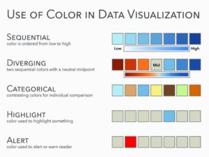
Image Source The Big Book of Dashboards—by Wexler, Shaffer and Cotgreave
Design Guidelines
As you build your dashboards, you should always consider the following:
- Goals: what will this dashboard be used for? Be sure to be laser focused.
- Audience: profile of audience and how they’ll likely consume and digest the information.
- Frequency: the higher the visit frequency, the less explanations you need to add.
- Length: the shorter the visit, the more important to maximize visual perception techniques
- Screen real estate: it’s usually limited, focus on an uncluttered approach.
- Experiment, get feedback, refine. After all, it’s about your audience loving the great stories from your dashboards!
To read more about telling your data story using dashboards, read our entire blog series by clicking on the topic below.
Introduction to Dashboards, How to Use Color, Chart Types and Formatting, Experimenting with Dashboards, Visualizations to Avoid, Layout
DataSelf Powered by Tableau
DataSelf isn’t just reports. It’s a whole way of looking at business intelligence and analytics. What if you could harness 5,000+ customizable reports with a system powered by Tableau Visual Analytics and a mature data warehouse framework? That’s the power behind DataSelf. Check out our video and see for yourself why companies love the customizable, integrated reporting dashboards we create. Contact DataSelf or call us at (888) 910-9802 x 1.