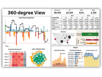
DataSelf ‘360’ Dashboard: Serving Executives Bites of Business Insight
U nlike employees whose work focuses on a specific department – sales, purchasing, manufacturing, or distribution – executives need more. Like a hungry customer at an all-you-can-eat buffet, executives need to take a taste of everything – from sales and service to the supply chain and payroll.
Historically it’s been virtually impossible to give executives a single view (report or dashboard) that brings together all those disparate data silos. The reality is that executives need visibility into all of those areas, but the data relating to them doesn’t reside in a single solution or database (such as ERP). Datasets for payroll, labor, contracts, and inventory, etc. often dwell in their own data silos.
The answer: a single, corporate overview dashboard showing metrics from every department and silo.
DataSelf’s ‘360’ Degree Dashboard
The ‘360’ dashboard is designed to be the one place executives can go to get the proverbial “20,000 foot” view of their business. With consolidated and enterprise-wide visibility, it brings analytics from all data silos together to offer insight into every applicable area of the business. And should a particular analytic need further attention, DataSelf’s functionality offers infinite drill down right from the overview dashboard.
With the ability to be quickly and easily customized to adapt to a business’ unique needs, the 360 dashboard looks across an organization to include insight into all areas from sales, cash flow, inventory, and payroll; to budget, e-commerce, labor, and others. Organizations can even choose to adopt multiple ‘360’ dashboards based on the needs of departmental managers – such as one dashboard for ‘360 Sales”, and another for the “360 Supply Chain”, etc.
All of DataSelf’s ‘360’ dashboards:
- . . . enable users to choose which reports & charts they’ll contain. (The default ‘360’ dashboard contains 15 embedded charts and graphs.)
- . . . can be configured to be auto-emailed to the desired recipients on a recurring schedule, such as ‘daily at 9 AM’.
- . . allow viewers interested in a specific segment of the ‘360’ to dynamically drill down into the full details of the related dashboard beneath it.
Business Insight Provided:
With the ‘360’ dashboard executives are instantly apprised of issues like . . .
- Cash flow problems
- Potential Stock outages
- Unacceptable budget to actual expenditure ratios
Want to see it in action? Check out this two-minute video demo of DataSelf’s 360 Dashboard here >>


