Roman poet, Ovid, once said, “Dripping water hollows out stone, not through force but through persistence.”
Through persistence and constant change, we’ve come a long way in the development of DataSelf’s dashboards. The key to this development always ties back to our clients’ satisfaction and needs.
Since 2005, we’ve been developing Dashboards 1.0, the feature set that comes out-of-the-box with DataSelf Analytics including 5,000 reports and dashboard templates. Our customers have been benefiting from Dashboards 1.0 which allows them to install the solution and hit the ground running quickly, focusing on analyzing their data on day one.
However, not all customers find the exact dashboard template they need with our solution. As one prospect told us “I don’t need 5,000 reports. I only need 20. And I can’t find them in your library. So, to me, 5,000 dashboards or zero is the same. I see no value!” Ouch! That one hurt but it’s a pretty fair point.
It’s true that our out of the box solution can be of little value to some organizations. After all, we’re not claiming to have all possible templates, we “just” have 5,000. And they are all easy to customize.
For instance, the prospect that couldn’t find their 20 reports in our library decided to invest in DataSelf when we tackled one of their reports in less than a minute during a demo. It turned out that many of those 20 reports were just a few customizable clicks away from our templates.
Still, we noticed that many clients wouldn’t take advantage of the library of reports our solution comes with. They would pull a subset of reports at the beginning of their BI project, and rarely would explore if more canned insights would be of value.
People are busy, and frankly, it’s actually intimidating and pretty easy for anyone to give up when navigating anything with over a few dozen entries, imagine 5,000+!
And that was our inspiration for dashboards 2.0!
Dashboard 2.0 – KPIs for specific business functions
In order to move forward, let’s go back to the beginning. Dashboard 1.0 was a collection of dashboards that were centered on one metric. One dashboard might look at YTD sales growth, another one shows sales last month, and another reveals open receivables.
Each dashboard 1.0 template was centered around a single metric or KPI of the business.
With Dashboard 2.0, we gather metrics that are important to a specific business role and organize them in a way that is easy to navigate and make sense. For instance:
- Salesperson
- Inventory manager
- CFO
- CEO
The question now becomes, what kind of information does the person in this role want to see in one dashboard to have an understanding of what they need to take action on?
Dashboard 2.0 has been built around the business role which empowers people to act quickly with real data. Single-metric dashboards are now combined to make up one, comprehensive dashboard.
360-degree View Inspired By a CFO
Case in point. The 360 Degree View of the Business dashboard was actually inspired by a CFO and one of our clients. C-level executives need to see metrics across many different areas of their business. Sales, inventory, financials, cash flow – all of these things matter and need to be looked at daily and this dashboards does so in a clear, organized fashion.
Expedited information that quickly drills down with more details is critical.
For example, the Top Level Dashboard may show inventory on hand is too high. A CFO or Inventory Manager can click on the red bar and see more information so he can take action.
Salesperson Dashboard
This template includes more than 60 different metrics or KPIs in a single workflow.
With Dashboard 1.0, a salesperson would have to find each one of those 60 different views individually. Now, this data is compiled into a single workflow.
Dashboard 2.0 on the go
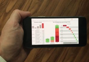
 Mobile insights offer your people on the go with easy to use dashboards generating detailed, real-time data. Real-time data helps you analyze inventory levels, slow-selling items, service customer trends, and more.
Dashboard 2.0 takes activates this data allowing you to click, call, email and open additional applications and documents all from your phone.
With this technology, you are not only informed about critical metrics, you are also able to expedite action fast and easy, anytime and anywhere.
Actionable Dashboards 2.0
Another focus of dashboards 2.0 is by making them not only insightful, but actionable.
In the past, BI was mostly used to view reports and get insights. To take action, such as making a call or sending an email, you had to leave the BI solution. Not anymore!
Here are a few actions you can take from right inside of DataSelf dashboards.
- Call the responsible person for a metric
- Send the responsible person an email
- Open documents or external applications
Dashboard 2.0 empowers people to connect the dots and take action in a way that’s intuitive, fast and all from your mobile device or desktop.
The future of BI is now! Are you ready to get insights from dashboards and take action anytime and anywhere?
Contact DataSelf online or call us at (888) 910-9802 to learn more about your options for fast, easy and actionable dashboards that enhance your business intelligence.


