Too much of a good thing—even a great thing—can be overwhelming. Edward Tufte says to avoid excessive decoration in the use of visual information. He coined the term “Data-Ink Ratio” or the amount of ink you put into your data visualization.
The right amount of ink can help you get your point across quickly and easily. The wrong amount can confuse or even inadvertently hide what you’re trying to say.
In this second part of our series on using dashboards to tell your data story, I’m going to focus on color. If you’d like to see the first blog in this series “Telling Your Story in Seconds – Part 1: Caveman Brain Science,” click here.
Use Less Ink
Most people go overboard when they create data visualizations. They use too many colors or fancy designs when simple ones are more effective.
Let’s take a look at two examples.
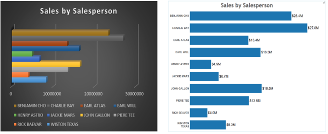
The charts above show the same information. The left one’s dark background, colored bars, 3D, and legend make it hard to tell what is going on here. There’s too much ink on the chart.
The right one is clean and simple. All color is used to represent the data so the eye can focus on the story.
Here’s another example of how too many colors can distract you.
The pie chart on the left has a classic data visualization mistake. I see it all the time. Too much ink and highlighting colors. Many people will put their eyes on the red and yellow slices (these colors are commonly used for highlighting), while the main story is the three big slices.
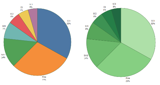
Now look at the pie chart on the right. Same data, but I used only one color with different shades. You can now focus on the three areas of market share that make up the big takeaways.
Use More Ink
There is definitely a time and a place for everything. That includes when to use more colors in your data visualizations.
The data visualizations below show sales by salesperson. At the top, the names are listed alphabetically so each rep can find their sales quickly. And the bottom chart is to see how they are doing on a descending order of sales.
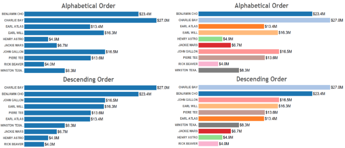
Can you see the problem on the left chart? Pick any name on the top chart and try to find his/her bar on the bottom chart. But with the chart on the right, once you memorize a color <> rep, it gets easy to find that bar on both charts. Actually, if the sales team is small and the same for a while, all people would eventually memorize the people and their colors and the top chart could be dropped altogether.
Color can also be used to help people identify information on multiple data visualizations when it is used consistently.
In the example below, by using the same color for the item in each chart, you don’t need a legend at all.
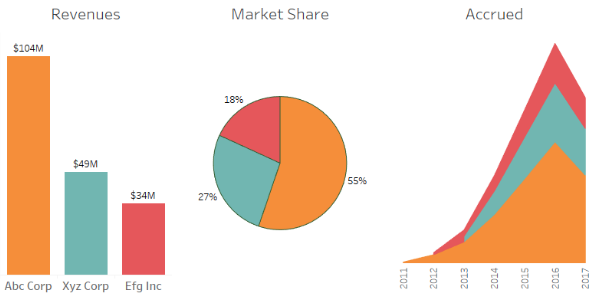
As you can see, color is your friend when it comes to data visualization.
- Use LESS when color makes it hard to pick out the important data or confuses the eye.
- Use MORE when you need to identify one element among many.
- Use the SAME colors consistently across multiple visualizations to make it easier to see the same thing in different ways.
Use of Bands and Lines
Sometimes bands and lines can be distracting. But sometimes they are a good way to highlight information. They can separate information into columns or rows that are easy to see and read.
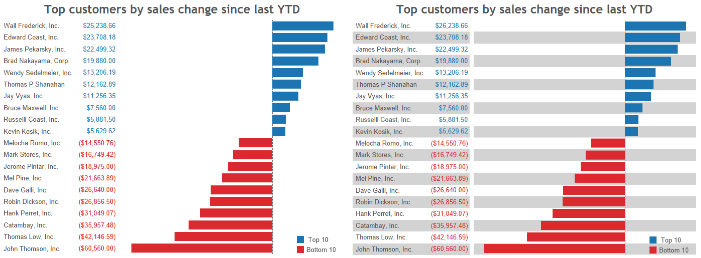
The left chart below is clean, but it can be difficult to relate a name to the related bar. In this case, adding more ink like shown on the right eliminates that problem.
Color to Highlight Actionable Information
Color can also be very helpful when you are trying to make information stand out.
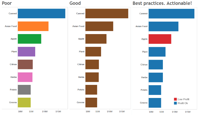
Below is a good example. Each of the three charts shows the same data, but notice how the chart on the far right makes one item stand out. The far right chart shows in a simple and elegant way two pieces of actionable information: sales in a descending order and which item has low profitability.
Last Words: Color Blindness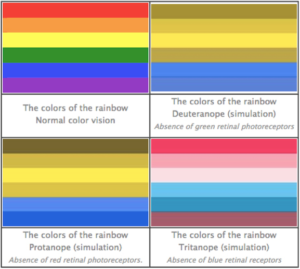
About 10% of men and 1% of women have some form of color blindness. The most common form is Deuteranopia which affects 6% of the population and makes it hard to tell the difference between red and green. Protanopia affects 2% and Tritanopia less than 1%.
Chart source: https://uxmag.com/articles/usability-tip-dont-rely-on-color-to-convey-your-message
If you are doing a presentation in front of a big audience or your dashboards are distributed to a large number of people, you should definitely use color-blind friendly colors. Even if you have a small but frequent audience, it’d be great if you learn if anyone is color blind. This could be done as a fun experiment during presentations, or in discreet ways by email asking if you should avoid color groups such as shown on the top left picture above.
If you need to rely on color to help you tell your story, it’s great if you use tools such as DataSelf Analytics that offer color-blind palettes to simplify your work.
To read more about telling your data story using dashboards, read our entire blog series by clicking on the topic below.
Introduction to Dashboards, How to Use Color, Chart Types and Formatting, Experimenting with Dashboards, Visualizations to Avoid, Layout
DataSelf Powered by Tableau
DataSelf isn’t just reports. It’s a whole way of looking at business intelligence and analytics. What if you could harness 8,000+ customizable reports with a system powered by Tableau Visual Analytics and a mature data warehouse framework? That’s the power behind DataSelf. Check out our video and see for yourself why companies love the customizable, integrated reporting dashboards we provide. Contact DataSelf or call us at (888) 910-9802 x 1.


