When you’re considering where to place information on a dashboard, always remember that the key to layout is location, location, location.
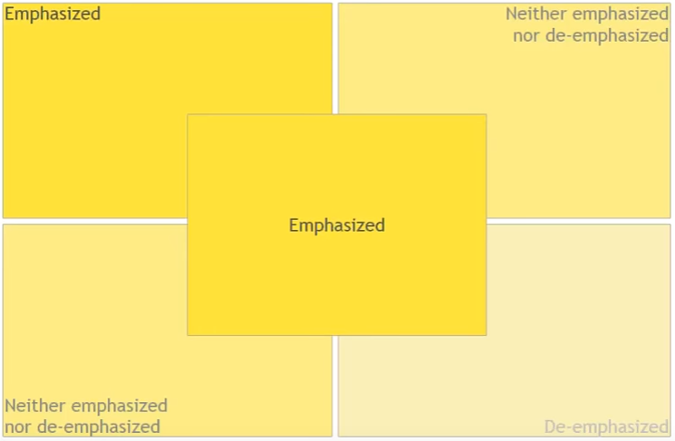
When you’re designing a dashboard, the top left quadrant as well as the center quadrant are the most important. Most people will quickly put their eyes on those two sections first. Therefore, you will want to focus the most important information of your dashboard in those two areas.
Talk Data to Me: Data Visualization Best Practices
Let’s say you want to put your logo on the dashboard. If the dashboard is being seen by people outside your company, for marketing purposes, you might consider putting your logo in the top left or center. This will help the user’s memory retain your logo.
If the dashboard is being seen by people inside your company, putting a logo in a prime real estate area of your dashboard is probably unnecessary.
Layout: Big Numbers and Eye-Tracking
What we have here, side by side, is the same dashboard. On the left we’ve placed big numbers metrics at the very top. On the right, the big numbers are at the bottom. Everything else is exactly the same.
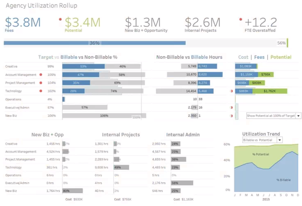
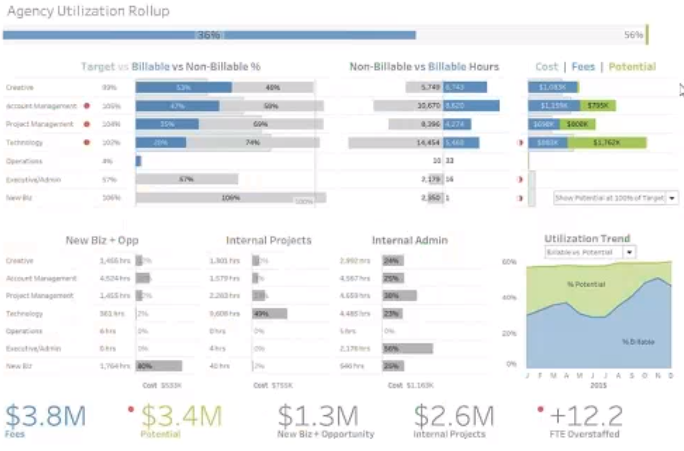
Let’s look at what happens after 10 seconds of people looking at these two dashboards. Using eye-tracking technology, we can show the heat maps below, which reveals where the users’ eyes were driven to.
In the dashboard on the left, users will see the big numbers and some of the other information as well. On the dashboard on the right, the big numbers are pretty much not seen at all.
So, if you’re putting out information with big numbers, that means they are important. Therefore, they must be posted on prime real estate: that’s in the top left or in the middle of your dashboard.
Layout: Quick Tips
- Avoid scrollbars: Nope! Users don’t scroll. After all, if I can’t see the info, it’s because it’s not important. Correct?
- Date/time stamps: If a dashboard has real-time data, then you’re all set. But, if there’s data that is not real-time and that information is important for telling the story, be sure to post date/time stamps. Otherwise, people will assume it is real-time or some refresh schedule that might be completely inaccurate.
A Fun Example
Let’s take a look at a dashboard that does a great job with layout and charts.
The dashboard below is not a business dashboard, but it’s a good example of a dashboard designed for people who are going to be seeing this information only once in a while. Maybe only once.
They’ll probably be looking at this if they’re interested in Hummingbirds. They’re probably going to spend several minutes looking at this dashboard.
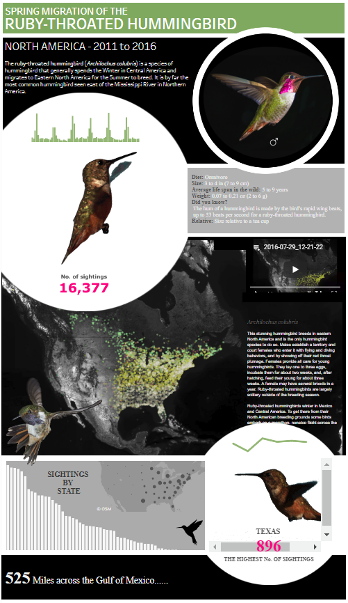
There’s a lot of text explaining the story that the dashboard is trying to convey. There’s also all of these cool, visuals. They can be a little distracting, but they talk about the whole message.
This is an example of a dashboard designed to share a lot of information. It’s very detailed, very beautiful, and designed for people who will spend quite some time only seeing this rarely. But, in doing so, they get very good insights.
I remember seeing this dashboard a few years back at a Tableau conference, and I was amazed by the great job done with this dashboard. It’s visually beautiful, it’s appealing, and every time I show someone an example of a beautiful dashboard that you will remember, this one is up my sleeve.
To read more about telling your data story using dashboards, read our entire blog series by clicking on the topic below.
Introduction to Dashboards, How to Use Color, Chart Types and Formatting, Experimenting with Dashboards, Visualizations to Avoid, Layout


